
Where it began
The Golden Apple
The apple carved “to the fairest” is the idea the House was founded on: the fairest was never one face.
 House of Mélora
A family story, expressed in a symbol.
Preview. Today’s House of Mélora logo stays in use until the new identity launches in Spring 2027.
Mélora’s visual identity brings together the Golden Apple and the letter M.
The apple connects the House to its founding story: daughters who are the apple of their father’s eyes. The M gives that story a recognizable signature across packaging, collections, and the wider brand.
Together, these elements express affection, creative inheritance, and a shared identity.
As the House develops, its mark provides a point of continuity: a reminder of where Mélora began and the family connection at its heart.
Where it began
The apple carved “to the fairest” is the idea the House was founded on: the fairest was never one face.

The mark
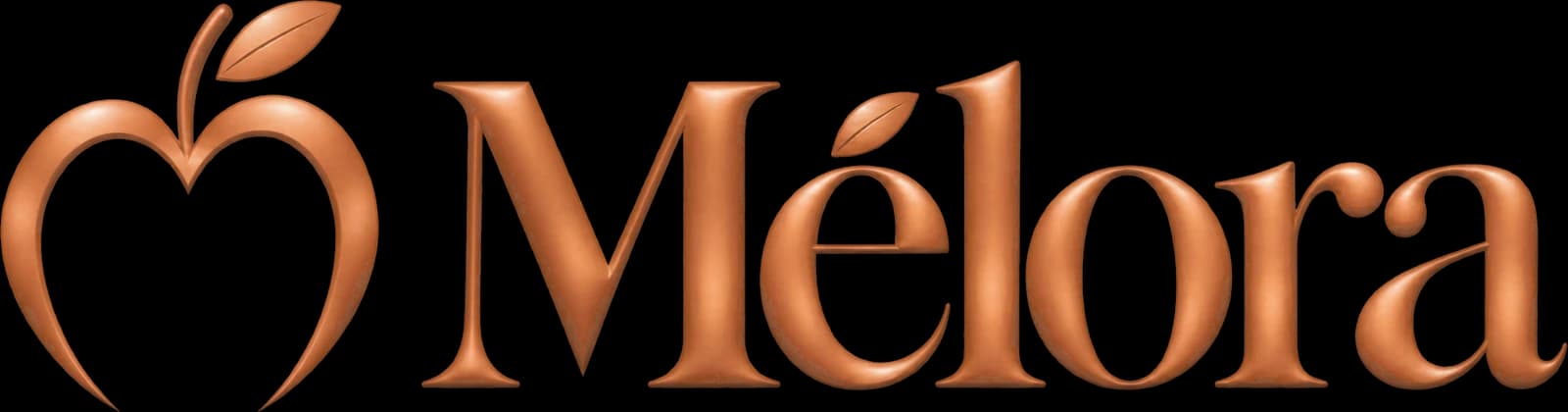
The apple opens into a heart, drawn in one copper line with its leaf. Room inside for every face.
Spring 2027
The mark meets the name, and the leaf comes to rest on the é. One signature for every house.
Launching Spring 2027
More in Culture & Heritage